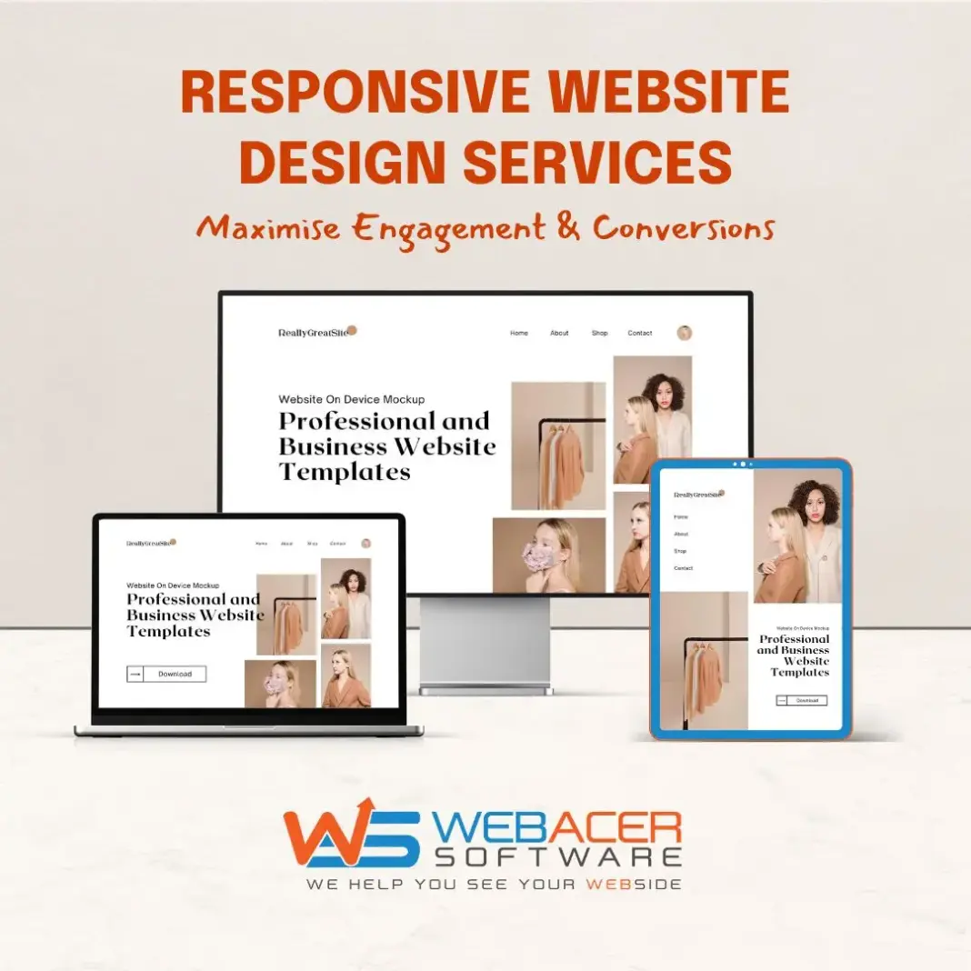
Responsive web design (RWD) is essential for businesses aiming to deliver consistent, device-agnostic user experiences. At WebAcer Software, we leverage responsive frameworks to build websites that adapt fluidly across mobiles, tablets, and desktops, ensuring your customers get the best version of your site—no matter the screen.
Explore how our professional web development services help businesses deliver pixel-perfect designs that work beautifully everywhere.
What is Responsive Web Design?
A User-Centric Design Philosophy
Responsive web design is a strategy that focuses on creating web pages that automatically adjust their layout and elements based on the screen size and capabilities of the user’s device. This adaptive approach reduces the need for resizing, panning, and scrolling—making websites more accessible and user-friendly.
It’s more than just fluid design; it’s about understanding your users and presenting content in a way that best serves their intent, environment, and goals.
Core Features of Responsive Web Design
The Three Pillars Every Modern Website Needs
To deliver a truly responsive experience, a website must implement all three of these technical foundations:
- Flexible Grid Layouts
Instead of using fixed dimensions, responsive grids use relative units like percentages, allowing page elements to expand or shrink based on screen size. - Responsive Media & Images
Media elements, including images and videos, are sized using relative units and CSS rules to ensure they remain within their containers, regardless of screen resolution. - Media Queries and Listeners
These CSS3 rules detect the device’s characteristics—primarily screen width—and apply targeted styles to deliver an optimal layout.
Beyond Layout: Considering User Intent
Designing for Context, Not Just Screen Size
Responsive design isn’t just about resizing content—it’s about understanding how user behaviour changes across devices. A mobile visitor might want quick access to contact details or services, while a desktop user might explore in-depth case studies or resources.
Designing responsively means:
- Prioritising the most relevant content for each device type
- Ensuring critical actions (like calls or form submissions) remain easily accessible
- Avoiding assumptions—mobile users often need full functionality, not just a stripped-down version
Advantages of Responsive Web Design
Why Modern Businesses Must Prioritise It
Responsive design offers tangible benefits that go beyond aesthetics:
- Improved Mobile UX
With over half of global traffic coming from mobile, delivering fast, intuitive interfaces on small screens is crucial for engagement. - Better SEO Performance
Google prefers mobile-first indexing, meaning responsive sites are more likely to rank higher in search results. - Reduced Maintenance Effort
A single codebase means less development time and cost, with updates automatically applied across all devices. - Faster Load Times on Mobile Networks
Combining client-side media queries with server-side techniques (RESS) ensures content loads faster, especially on slower connections. - Higher Conversion Rates
By matching user needs and intent across devices, you’ll convert more leads, reduce bounce rates, and improve retention. - Future-Proof Scalability
Responsive frameworks are built to handle emerging devices and screen sizes, making your website ready for what’s next.
Why Choose WebAcer Software for Responsive Web Design?
Expert-Led Solutions with Performance in Mind
We understand that your website is the front door to your brand. At WebAcer Software, our responsive web design solutions are crafted to:
- Align with your business goals
- Enhance UX across all screen sizes
- Ensure maximum SEO and performance optimisation
- Support high-conversion layouts and content structures
Explore our tailored custom web development services to see how we build future-ready digital experiences.
Our Technical Approach to Responsive Web Design
Frameworks, Methodologies, and Tools We Use
At WebAcer Software, we combine best-in-class tools with custom strategy to create robust, responsive digital experiences that meet modern performance standards.
Here’s how we build responsive websites that perform at scale:
- Mobile-First Design Philosophy
We always start with mobile in mind—prioritising critical content and functionality on smaller screens, then scaling up progressively for tablets and desktops. - Frameworks We Use
We utilise responsive front-end frameworks like:- Bootstrap 5 – Clean grid systems, mobile-first utilities, and built-in responsiveness
- Tailwind CSS – Utility-first framework enabling fast, responsive layout creation
- Foundation by Zurb – Advanced responsive toolkit for enterprise-grade needs
- Custom CSS3 Grid & Flexbox – When performance or design flexibility calls for pure customisation
- Media Queries Best Practices
We write layered media queries targeting breakpoints such as:480px(mobile portrait)768px(tablet)1024px(small desktop)1280px+(widescreens)
- Fluid Typography and Spacing
Usingclamp()andvwunits, we ensure text and spacing adapt smoothly across breakpoints—maintaining readability and aesthetics. - Performance Optimisation
From image compression (WebP, AVIF formats) to lazy loading and minification, we optimise every asset for fast mobile loading. - Testing Across Devices & Browsers
We test on:- Chrome, Safari, Firefox, and Edge
- iOS and Android devices of various screen sizes
- Emulators and real devices to cover both functional and visual accuracy
Responsive Web Design FAQs
Common Questions from Our Clients
Q1: How is responsive design different from mobile-friendly design?
A: Mobile-friendly sites may look acceptable on a mobile device but don’t necessarily adapt. Responsive design dynamically adjusts layouts, content, and elements based on device properties—offering a more polished and flexible experience.
Q2: Do you support older browsers like Internet Explorer?
A: While we optimise for modern browsers, we ensure graceful degradation for legacy browsers when needed. However, we recommend focusing on evergreen browsers for long-term support.
Q3: Can I convert my current static website into a responsive one?
A: Yes, our team can audit your existing site and implement responsive layouts using your current assets or redesign it entirely with a fresh, responsive-first approach.
Q4: Which CMS platforms do you support for responsive sites?
A: We build responsive designs across platforms including:
- WordPress
- Webflow
- Shopify
- Headless CMS (e.g., Strapi, Sanity)
- Custom-coded systems using Laravel or Node.js
Q5: Will responsive design slow down my site?
A: Not if implemented correctly. We prioritise lightweight design systems, use responsive images, and apply performance best practices to make your site fast on any device.


