YOUR SENIOR TECHNICAL PARTNER FOR SCALABLE WEB APPLICATIONS
I'm Ajeet Kumar, a Senior Partner helping Australian Agencies & SaaS Founders eliminate tech bottlenecks and build applications that last.

Are You Building a Business on a Shaky Foundation?
Does this sound familiar?
The Right Partner is an Architect, Not Just a Coder.
For 17+ years, I've seen businesses get stuck because they underinvested in their core architecture. I'm Ajeet Kumar. I'm not a freelancer you hire to complete tickets. I'm a senior technical partner who joins your team to make the right foundational decisions, ensuring what we build today is ready for tomorrow.
How I Help You Build with Confidence
Scalable Web App Architecture
I design and build the core of your application using proven, robust technologies like Laravel and the MERN stack.
Technical Audits & Roadmapping
I'll conduct a deep-dive audit of your existing codebase and provide a clear, prioritized roadmap for improvement.
Agency & Team Augmentation
I integrate with your existing setup, providing the hands-on senior leadership needed to unblock critical projects.
Proven Results: Real Projects, Real Impact
See how I've helped businesses transform their operations with custom technical solutions
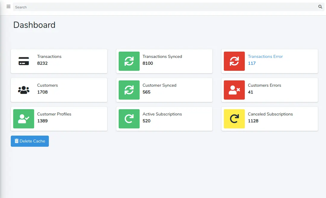
Custom Web Application for Recurring Billing Automation
Apr 2020 - Dec 2021
Challenge
Managing 1,000+ monthly recurring clients with manual processes, leading to errors and inefficiencies
Solution
- •Integrated Authorize.net for automated recurring billing and customer profile management
- •Connected HubSpot API for seamless client data synchronization
- •Built comprehensive admin dashboard for subscriptions, billing, and reporting
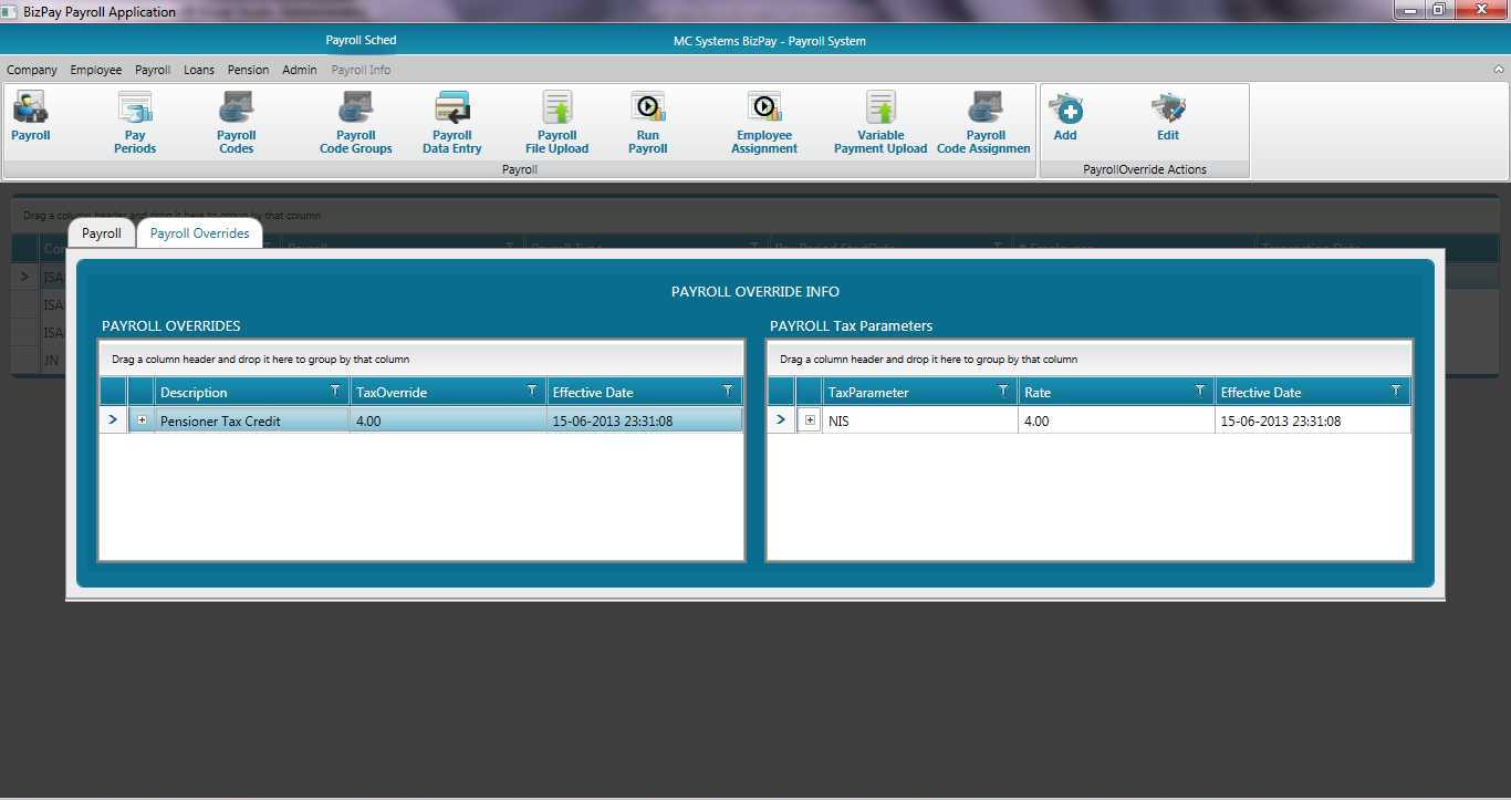
Attendance And Payroll Management Software
Jan 2022 - Jan 2024
Challenge
Manual payroll processing causing errors, time-consuming calculations, and compliance issues with tax regulations
Solution
- •Automated payroll calculations, tax deductions, and employee record management
- •Implemented employee time tracking and salary generation system
- •Integrated with accounting platforms for seamless financial reporting
- •Built-in compliance with local tax regulations
Experience Isn't Expensive. Rework Is.
The Alternatives
The Partner Advantage
What My Partners Say
Proof from 17+ years of building trusted, long-term relationships.
" Ajeet is fast, expert, and a great communicator... The job turned out to be more complicated than we had anticipated... Ajeet was able to adjust with grace and speed. I give him a 10 out of 10. "
Datta Groover
Groover Seminars Inc., United States
" Ajeet is truly first-rate. We work with many freelancers... Ajeet ranks among the very best, easily. Interaction has been ideal, as has been his work. We will definitely work with Ajeet again... "
Jeff Kurtz
Resultli LLC, United States
" I am EXTREMELY happy with the results... We will be using them again... in fact, we're closing this contract only to open up another one with another project. Absolutely stellar work. "
Sean
Las Vegas, United States
" Excellent work from Ajeet - quickly understood the project scope and purpose and helped us improve the product quickly. "
David Pattison
Astarte, Australia
Ready to Build a Foundation for Growth?
Let's stop patching problems and start building a real, lasting asset. Book a complimentary, no-obligation 15-minute strategy call to discuss your goals.